
Text and graphics overlapping in Playground
complete
Torfinn Brokke
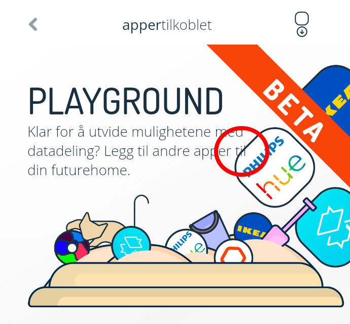
This is just nitpicking, I know, but it has annoyed me ever since Playground was launched: Part of the header text overlaps the graphics, at least in the Norwegian language version. See attached image (inside the red circle). I think this should be adjusted to avoid the overlap, in my eyes it looks a bit messy.

Espen Håland
complete
Minor design changes for playground in app version 5.4.0
https://futurehome.canny.io/changelog/app-update-1
Espen Håland
planned